Design System
Building a Visual Language (2B)
Overview
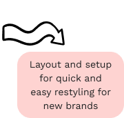
A collection of customisable UI elements, design patterns and standards, created as part of the YZ project for Sailing, with the aim of improving consistency and quality of both our digital products and the product design experience.
Time
Nov 2020—Apr 2021
Services
UI, Design system
The Challenge
When embarking on a new project, it can be exhilarating to have a blank slate and let creativity flow. However, when multiple designers are collaborating on the same project and deadlines are looming, it's beneficial to have a cohesive system in place that provides pre-refined and validated components and patterns. This allows designers and developers to avoid repeating work, freeing up time to tackle bigger challenges and produce higher quality results.
Initially, our design team developed a small component library within Sketch to assist in building websites for YZ brands. As the company grew and the components were adapted and implemented by multiple delivery teams for clients with varying needs, the components began to diverge. This led to sites that were difficult to maintain and had inconsistent features and behaviors.
Since we were already working on refining these components for the YZ project, our team proposed the Design System as the most efficient way to organize and distribute designs, code, and usage guidelines. This system could then be expanded to include other Sailing products. We named it YZDS.
Information Gathering
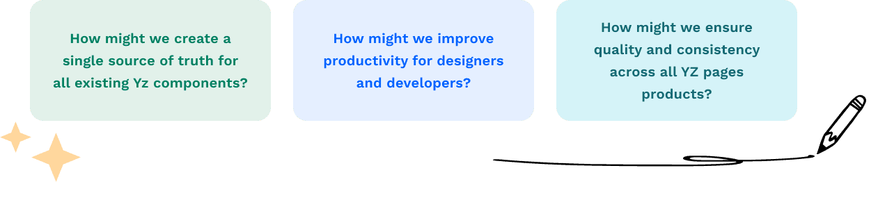
To start, we gathered and reviewed various resources such as style guides, Google docs, Dropbox folders, Confluence pages, and Sketch files. Afterwards, we conducted interviews with designers, developers, and product managers to identify their unmet needs and determine how a design system could enhance their workflows.
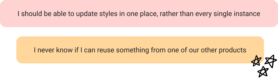
Designers expressed that creating common patterns from scratch with limited visibility on reusable components was inefficient, while developers shared that building and maintaining different patterns for each site was time-consuming. Both groups found it challenging to determine which of a project's multiple Sketch files, all named 'final,' they should be working from. Additionally, the absence of a shared language often led to confusion over breakpoints and expected functionality.
Design Approach
To determine how best to approach these issues, I ran workshops with the wider design team to define the technologies and tools we could use to improve our workflow, grid and breakpoint usage and developer handover process.
We chose to adopt the 8px grid system with 24 columns on XL/L breakpoints and 8 as the browser sizes down. This allowed us to create more interesting layouts whilst introducing consistency and rhythm across products, and avoiding the rendering issues associated with scaling half pixels.
更高效的团队协作,我们能即时获取品信息,同步设计内容
适应快速迭代,我们和前端一起建立公共样式库 减少重复工作,统一风格


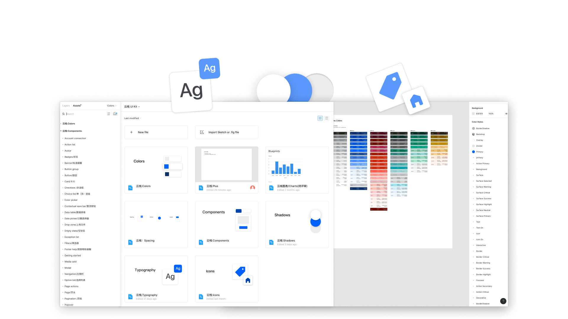
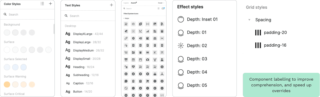
Shared Design Language
Atomic Design was a familiar concept to everyone in the team, so we decided to start by organising elements into Atoms, Molecules, Organisms, Templates and Pages. The development team adopting VUE as their JavaScript library also helped us to align, as we were all thinking about the project in terms of creating complex interfaces from small building blocks.
We wanted to user test this grouping with designers and product owners outside of our team, so that we could ensure a smooth handover to any team picking up a new client website. We provided each user with a list of components of varying complexity (e.g. button, header, product gallery) and asked where they would expect to find these. We discovered that our categorisations weren’t as intuitive as we hoped, especially when it came to differentiating molecules from organisms.
We trialled an alternative grouping system based on the language already used throughout the company. Typography, colours and grids sit within ‘styles’; atoms, molecules and smaller organisms under ‘elements’; and larger organisms in ‘components’. Cards sat in their own section, as did all elements associated with product purchase. This terminology update was popular with stakeholders, and I would have liked to have refined it further with the involvement of the engineering team, but we chose to revert to our original categorisation due to time restrictions.
Library Design
As well as the symbol renaming and categorisation work, I collaborated with a UX designer to select and user test emoji in the left navigation to provide additional visual clues and improve comprehension at a glance. It was fascinating to discover how differently the design team interpret certain emoji,
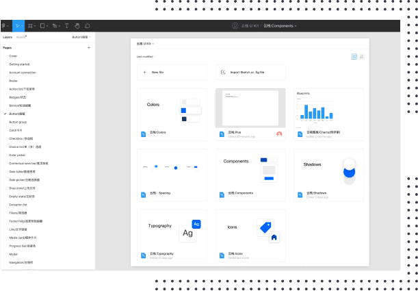
Most UI kits we looked at for inspiration on page layout were organised horizontally, with with hundreds of elements presented on one page. We decided to add more pages and let the user explore using the left navigation, in order to provide an always-visible index and to align with the layout of the VUE library. This also leaves us room to add more components as and when new Sailing products are incorporated into the design system. Each title page contains quick links to its subpages to improve findability.
Guidelines and Documentation
Good documentation serves to define and communicate the visual design, user experience and engineering values, as well as a consistent design, development and new feature governance process. This would allow other internal and external teams to quickly adopt the platform, and work in harmony with each other.
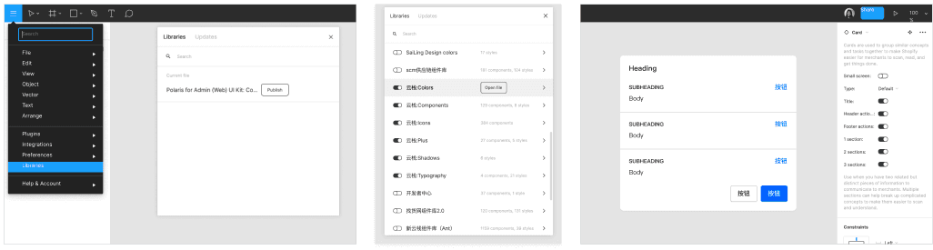
The system was created to be themeable, so we provided multiple variations of each component, so to keep the library streamlined and clean, designers could delete versions unsuitable for their brand. Within the UI kit, we wanted to make it clear to designers why certain decisions had been made. Everyone has their own way of working and their own shortcuts and plugins, so we felt it was important to explain what was fixed, and the risks involved in changing certain aspects.
The engineering lead and I worked with a technical writer to ensure all documentation was consistent and easy to understand. The design system’s landing page provides three gates - one for designers, one for developers and one for content editors. The guidelines behind each section are tailored to keep these sections succinct and relevant.
Documentation and usage guidelines, along with semantic naming allow for easier onboarding
Outcome
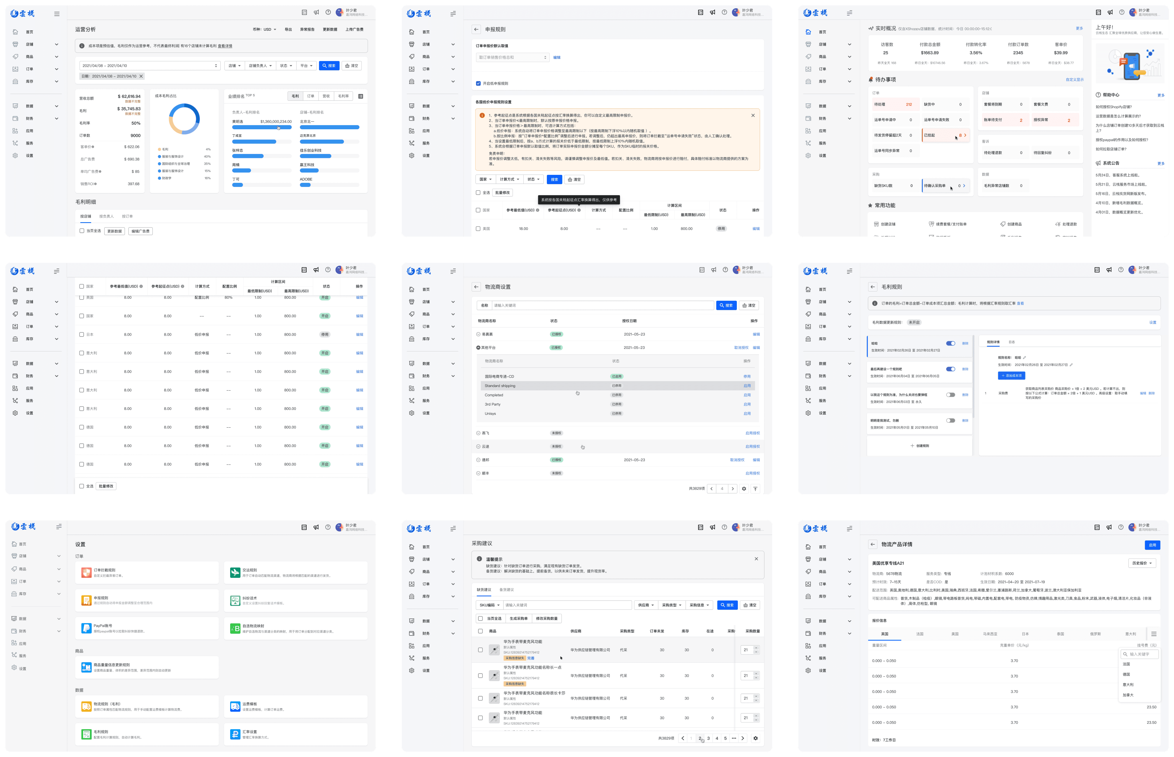
The YZ design system brought together the FIgma UI kit, VUE components, design and development values and usage guidelines for our users useful web platform to ensure all new pages follow the same experience, accessibility and performance standards.
The first site launch showed that page build time decreased by 75% for developers, and reduced the time designers could wireframe a 10-page responsive site from a week to half a day. Adopting the system enabled the team to rapidly prototype new features, improved the onboarding process for new designers and developers, as well as speeding up the handover process.